Monday, October 29, 2012

Is unemployment being under-reported?

Some conservatives have been claiming over the last several months that the unemployment situation during this recovery only "looks" like it's getting better because so many people are getting discouraged and have stopped looking for work. A few of the more unenlightened ones even claim there's a "cover-up" of the "real" unemployment numbers. That latter charge is completely false. The federal government reports on several different unemployment statistics every month. The ones we're concerned about are the U-3 (official) and U-6 (underemployed and discouraged) rates.

Before examining that first accusation, we need to define our terms.

Defining the terms


The U-3 rate (the one that makes the news) includes those over 16 years of age, who aren't institutionalized (which means not in a nursing home, prison, or the military), who are available for work, and who have looked for a job in the last four weeks.

The U-6 rate includes everyone in the U-3 number, plus the underemployed and the discouraged workers.

The "underemployed" are those who are working part-time who are available to work full-time, and who want to work full-time.

The "discouraged" are those who haven't actively looked for work in the last year.

So it's to be expected that the U-6 rate will always be higher than the U-3 rate.

Examining the data


The U-3 number is dropping. No argument there. It peaked at 10% in October 2009, and has since dropped to 7.8%. As I pointed out previously, that 7.8% is lower than after President Obama's first full month in office, which makes President Obama's record on unemployment better than any of his three Republican predecessors.

The contention of the conservatives is that the U-3 number is only dropping because more and more people are getting discouraged and not looking for work. If that's the case, we should see that the U-6 number is rising as more and more people stop looking for work or accept part-time jobs.

But that isn't the case. The U-6 number hit its peak (17.2%) in October 2009 and, like the U-3 number, has been dropping steadily since then. It's now down to 14.7%.

Here's a graph of the U-3 (blue) and U-6 (green) numbers since February 2009 (President Obama's first full month in office)


As the data and chart clearly show, the U-6 unemployment rate is higher than the U-3 unemployment rate. That's to be expected. The chart also shows that the U-6 number, although not dropping as fast as the U-3 number, is nonetheless dropping.

So it appears that the claim that the U-3 rate is dropping because more and more people are discouraged is, at best overstated, and at worst completely false.

Friday, October 26, 2012

Comparing the last two recessions

Here's more information about this recession as opposed to the previous one. In the graph below, I lined up the starting points of the two recessions. In addition, I assigned both recessions the same starting value. So the vertical axis represents the amount that the unemployment rate increased (or decreased over time). The value "2.0" on the vertical axis represents a doubling of the unemployment rate. I also pointed to where each recession officially started, where each one officially ended, and where unemployment returned to the starting point (for the 2001 recession). This should make it a little more obvious how much more severe the Great Recession was than the one before it.


In the 2001 recession, unemployment didn't return to its starting point until 59 months after the recession was officially over. This recovery won't hit that point until April, 2014.

In the second chart (below), I did the same thing as the chart above, but I didn't assign the same starting value, so the vertical axis represents the actual unemployment rate. This should make it even more obvious that the Great Recession was much more severe than the 2001 recession.

Now let's move on to GDP (Gross Domestic Product - the value of all the goods and services produced in this country). The chart below lines up the starting points of the two recessions. Like the chart above, the red line represents the 2001 recession (March - November 2001), and the blue line represents the Great Recession (December 2007 - June 2009).

Pretty obvious, isn't it? no matter how you look at it, the Great Recession was longer and much more severe than the previous recession.


Tuesday, October 23, 2012

The unemployment records of Presidents Reagan and Obama

In my previous post, I demonstrated that the unemployment record of President Obama at this point (October) in his first term is better than that of his predecessor. But what about the unemployment record of President Reagan? There are many references to the "Reagan miracle"  - conservatives frequently cite the Reagan tax cuts as a model for how to create full employment. So here's the comparison.

The Reagan record

Unemployment was 7.4% at the end of February 1981, President Reagan's first full month in office. In October 1984, thanks to those by now famous tax cuts, unemployment had fallen all the way to ... wait for it ... 7.4%. That's right. At this point in President Reagan's first term, unemployment was exactly where it was at the end of his first full month in office. Here's a graph of the unemployment rates for his first term.

Unemployment in Reagan's first term


The Obama record

Here's the same graph for President Obama's first term thus far.
Unemployment in Obama's first term


Unemployment was 8.3% at the end of President Obama's first full month in office (February 2009), and lower (7.8%) now.


President Reagan did have to deal with a high inflation rate during his first term, but the recession during that term was both shorter and milder than this one. Despite that, and despite those famous Reagan tax cuts, unemployment at this point in President Reagan 's first term was the same as after his first full month in office. And despite the longer, more severe recession, unemployment at this point in President Obama's first term is lower than after his first full month in office.

If we line up their starting points (the end of their respective first full months in office), here's what we get this:

First term unemployment for Reagan (blue) and Obama (pink)
The conclusions are inescapable. Despite a longer, more severe recession, President Obama kept unemployment lower than President Reagan, and actually ended with unemployment slightly better than President Reagan.

Should we start calling this the Obama miracle?

Friday, October 19, 2012

The unemployment records of Presidents Obama and Bush II


In this post, I'm going to compare the Obama record on unemployment with that of the second President Bush. The data clearly shows that President Obama actually has a better record in reducing unemployment than his predecessor.

The Bush Record


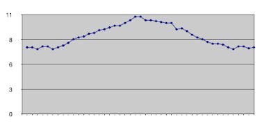
Here (data courtesy of the Bureau of Labor Statistics) is a graph of the unemployment rate by month for President George W Bush's first term:

Unemployment rate for President Bush's first term

Unemployment was 4.2% at the end of President Bush's first full month in office (February 2001), and higher (5.4%) in October 2004, near the end of his first term. Despite two rounds of tax cuts.

The Obama Record


Here's the same graph for President Obama's first term thus far.
Unemployment rate for President Obama's first term


Unemployment was 8.3% at the end of President Obama's first full month in office (February 2009), and lower (7.8%) now.

In my previous post, I showed that this recession is both longer and more severe than the one during President Bush's first term. Despite the milder, shorter recession, unemployment at this point in President Bush's first term was higher than after his first full month in office. And despite the longer, more severe recession, unemployment at this point in President Obama's first term is lower than after his first full month in office.

If we line up their starting points (the end of their respective first full months in office), here's what we get:
First term unemployment rates for Bush (blue) and Obama (pink)

The conclusion is unavoidable. President Obama has a significantly better record on unemployment at this point in his administration than did President Bush.

Wednesday, October 17, 2012

Why hasn't unemployment recovered yet?

To answer that question, let's compare this recession (aka the "Great Recession") with the preceding one.

The early 2000's recession


The early 2000’s recession lasted 8 months (March 2001 - November 2001). The GDP dropped a barely noticeable 0.3%. Unemployment rose from 4.3% to 5.5%. But, like the recession before it, the unemployment rate kept on rising after the recession had officially ended, peaking at 6.3% in June 2003. The unemployment rate has never dropped back down to where it started. The closest it came was 4.4% in October 2006, one month short of five years after the recession officially ended.

The "Great Recession"


The "Great Recession" officially began in December 2007 and lasted eighteen months, officially ending in June 2009. That's more than twice as long as the preceding one.

This recession was by any standard much more severe than the previous one. The GDP dropped 5.1% (a huge decrease compared with the last one). The unemployment rate rose from 5% in December 2007 to 9.5% in June 2009. Like the preceding two recessions, unemployment kept on rising, peaking out at 10% in October 09. So far, it’s dropped back down to 7.8%.

H's a chart that compares the GDP growth rate for both recessions:


As you can clearly see, the Great Recession (in red) was clearly both longer and more severe in terms of GDP than was the previous recession (in blue).

Now that we've compared the recessions, let's compare the recoveries.

Comparing the recoveries


After the last recession, it took the unemployment rate almost exactly five years - after the recession officially ended - to fully recover. We haven't reached the five year mark, and won't until May 2014.
Here's a graph comparing the unemployment rates:
Unemployment following the 2001 recession (blue) and Great Recession (pink)


This downturn has been much more severe than the last one. And we won't reach the point where the recovery from the 2001 recession was complete until the summer of 2014.